- CATEGORY : ORGANIZATION / INSTITUTION, SPORTS / TOURISM / ECOLOGY
- TYPE : CORPORATE IDENTITY, BRAND DESIGN
- CLIENT: ZPRP
- YEAR: 2008
Design of a logo of the Polish Handball Federation brand and visual identity system.

Design of a logo of the Polish Handball Federation brand and visual identity system.
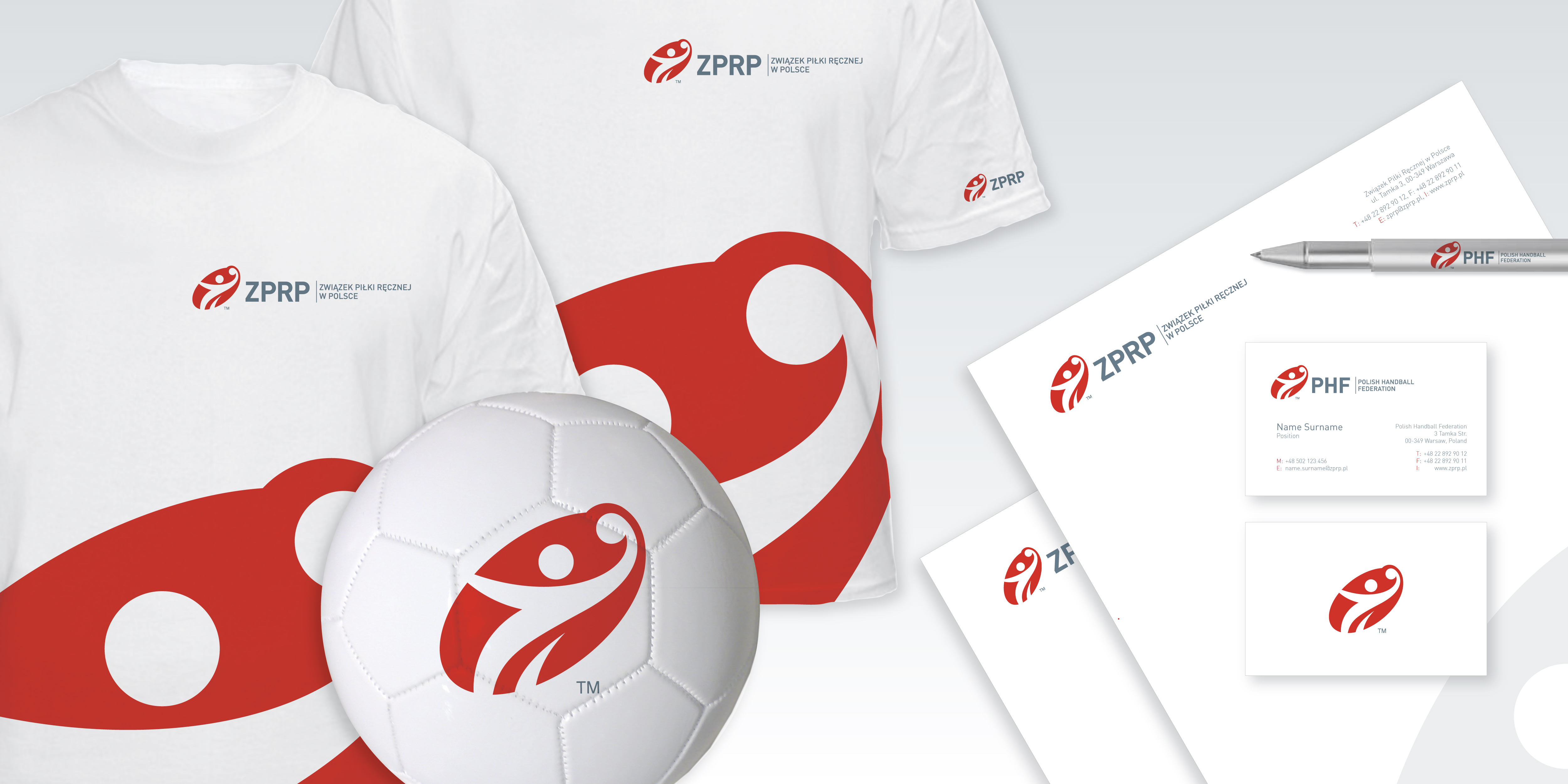


The Polish Handball Federation is a long-established organisation with over 90 years of history. Its logo reflected the reality of a bygone era and there was no visual identity system to be used for promotional purposes. It hindered the development of a new and modern brand that the Federation aspired to be.
SIGNATURE suggested a revolutionary change of the logo and created a new, visually modern identity system based on the designed graphic sign. The new logo synthetically depicts a player throwing the ball whereas the logo ellipse is a reference to the spotlight. The logo was designed in two language (Polish and English) versions.
The works on the system included designs of business stationery, promotional and advertising materials, gadgets, gifts, medals, as well as urban and architectural signage. Additionally, an occasional sign to mark the 90th anniversary of Handball in Poland and the federation’s flag were designed.